 Budget
Reports
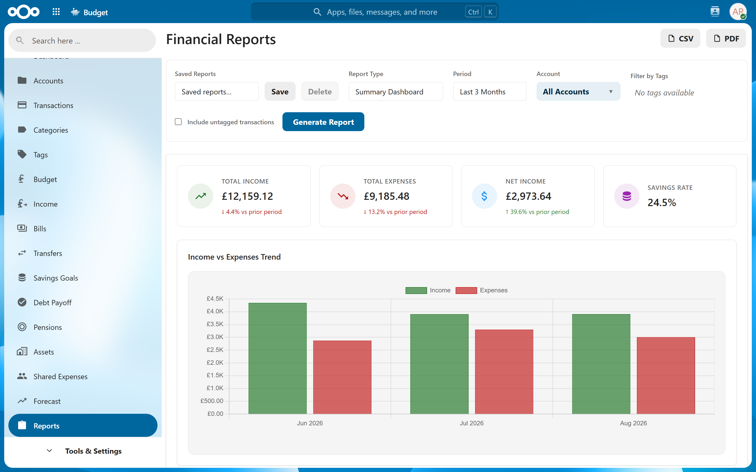
Reports provide seven specialized views of your financial data — from budget tracking and spending breakdowns to year-over-year comparisons and net worth history. Each report can be filtered, customized, and exported.
Overview#
The Reports section offers different perspectives on your finances. Each report type answers a specific question: Are you sticking to your budget? Where is your money going? How does this year compare to last? Use reports for periodic financial reviews or to investigate specific spending concerns.
Navigate to Reports and select the report type you want to generate.
Account Scope#
Use the Account selector to limit a report to specific accounts. If other people have shared accounts with you, an "Exclude shared accounts" toggle also appears — turn it on to base the report on your own accounts only, leaving out accounts shared to you. It's off by default (shared accounts are included), and only shows up when you actually have shared accounts. The same option is available per-card on the account-based dashboard tiles, via each tile's gear menu.
Note: A transfer between one of your own accounts and a shared account can only be partly seen when shared accounts are excluded, so income/expense totals may be slightly overstated in that case.
Transfers#
Money moved between your own accounts is not income or spending, so linked transfer pairs are left out of every report figure when reporting across all accounts — the same rule the dashboard totals follow. Filter a report to a single account and that account's own transfer legs are shown, because the money genuinely entered or left that account.
Only transfers the app knows to be transfers are excluded: ones created with the Transfer type when adding a transaction, recurring transfers, and transaction pairs joined with Match transfer. Two unlinked transactions entered by hand count as ordinary income and spending until you link them.
Budget Report#
The Budget Report compares your planned budget against actual spending by category over a selected date range.
What It Shows#
| Column | Description |
|---|---|
| Category | Each category with a budget set. |
| Budgeted | The amount you allocated for the period. |
| Actual | The amount actually spent. |
| Difference | Over or under budget (positive means under budget, negative means overspent). |
| Progress Bar | Visual fill showing percentage of budget consumed. Turns red when exceeding 100%. |
Filters#
- Date Range — Select the period to analyze (current month, last month, custom range).
- Categories — Include all categories or select specific ones.
Tip: Run this report at the end of each month to see where you overspent and adjust next month's budget accordingly.
Spending by Category#
A visual breakdown of where your money goes, displayed as pie charts and bar charts.
What It Shows#
- Pie Chart — Proportional spending by category. Hover over slices to see amounts and percentages. Click a slice to jump to the transaction list filtered to that category and the report's date range.
- Bar Chart — Ranked list of categories by total spending, making it easy to identify your largest expenses.
- Subcategory Drill-Down — Click a category to see spending broken down by its subcategories.
Filters#
| Filter | Options |
|---|---|
| Date Range | Any custom date range, or presets (this month, last month, this year, etc.). |
| Account | All accounts or a specific account. |
| Tags | Filter to transactions with specific tags. |
Note: Only expense transactions are included by default. Income categories are excluded to focus the view on where money is being spent.
Income & Expenses#
Two tables for a chosen period: everything that came in, broken down by category, and everything that went out, broken down by category. Built for the year-end job of producing a statement of income and expenditure — for a club, a society, or your own annual review.
What It Shows#
| Element | Description |
|---|---|
| Income table | One row per income category, with the total and the number of transactions, largest first. |
| Expenses table | The same for spending categories. |
| Summary | Total income, total expenses, and the net between them for the period. |
Filters#
| Filter | Options |
|---|---|
| Date Range | Any custom range or preset. Set it to 1 January – 31 December for a calendar-year statement. |
| Account | All accounts or specific accounts. |
Exporting to CSV keeps the two tables as separate labelled sections in one file, so a spreadsheet can take each on its own.
Note: Categories and accounts you have marked as excluded from reports are left out here, as they are in every other report. If you want a plain list of every booking with nothing removed, export from the Transactions page instead.
Tip: This report answers "what came in and what went out, by category". For the same question month by month with a savings line, use Cash Flow below.
Income vs Expenses#
A side-by-side comparison of total income and total expenses over time, with net savings calculated.
What It Shows#
| Element | Description |
|---|---|
| Monthly Bars | Paired bars for each month showing total income and total expenses. |
| Net Savings Line | The difference between income and expenses, plotted as a line overlaying the bar chart. Positive values mean you saved money; negative means you spent more than you earned. |
| Summary Row | Totals for the selected period: total income, total expenses, and net savings (both amount and percentage). |
Filters#
- Date Range — Select the period to compare (defaults to the last 12 months).
- Account — All accounts or a specific account.
Tip: This report is ideal for spotting months where expenses spiked relative to income. Look for patterns — do you overspend in certain months consistently?
Money Flow#
A flow diagram of where the period's money came from and where it went. Income categories stream into a central Cash Flow node, which fans out into your expense categories — each parent category splitting further into the subcategories that carry its spending. Whatever is left over shows as a green Surplus band; if you spent more than you earned, a red Deficit band feeds the flow instead.
What It Shows#
| Element | Description |
|---|---|
| Income bands | One per top-level income category (subcategory income rolls up into its parent), sized by the amount received. |
| Cash Flow node | The central hub every flow passes through. |
| Expense bands | Parent categories fan out from the center; subcategories fan out from their parent. Each carries the category's colour and its netted amount — refunds reduce the flow. |
| Surplus / Deficit | The gap between income and expenses, as a flow of its own. |
Filters#
- Date Range — The period the flows cover.
- Exclude shared accounts — Same toggle as the other reports. (The account selector does not apply to this report.)
Tip: The band widths are proportional, so the biggest drains on your income are visible at a glance — and a thin Surplus band next to thick expense bands tells its own story.
Year-over-Year Comparison#
Compare your spending across two or more years side by side to identify long-term trends.
What It Shows#
- Monthly Comparison — Each month's spending shown for each selected year in adjacent columns or overlaid lines.
- Category Breakdown — Drill into specific categories to see how spending in that category changed year to year.
- Annual Totals — Summary row with total spending per year and the percentage change.
Filters#
| Filter | Options |
|---|---|
| Years | Select 2 or more years to compare. |
| Categories | All categories or specific selections. |
| Account | All accounts or a specific account. |
Tip: Year-over-year is particularly useful for catching lifestyle inflation — gradual spending increases that are hard to notice month to month but obvious when comparing annual totals.
Bills Calendar#
An annual overview showing which months your bills are due, helping you visualize your fixed obligations across the year.
Views#
| View | Description |
|---|---|
| Heatmap | A color-coded grid with months as columns and bills as rows. Darker cells indicate higher amounts. Provides a quick visual sense of which months are most expensive. |
| Table | A detailed table listing each bill and the months it is due. Paid bills are shown with |
Information Displayed#
- Bill amounts per month based on frequency.
- Paid status — Paid months shown with strikethrough text; unpaid months shown normally.
- Monthly totals — The sum of all bill amounts due in each month, shown in the footer row.
- Annual total — The sum of all bills for the full year.
Filters#
| Filter | Options |
|---|---|
| Status | Active, Inactive, or All bills. |
| Account | Filter to bills linked to a specific account. |
| Include Transfers | Toggle whether inter-account transfers appear alongside bills. |
Tip: Use the Bills Calendar at the start of the year to understand your fixed monthly obligations. It helps identify months with concentrated due dates where cash flow might be tight.
Net Worth History#
Track your total net worth over time — assets minus liabilities — with daily automatic snapshots and support for multiple currencies.
What It Shows#
| Element | Description |
|---|---|
| Net Worth Line | Your total net worth plotted over time. |
| Assets Line | Total value of asset accounts (checking, savings, investments). |
| Liabilities Line | Total value of liability accounts (credit cards, loans). |
| Non-Liquid Assets | Separately tracked items like property or vehicles that contribute to net worth but are not readily spendable. |
How Snapshots Work#
- Automatic Daily Snapshots — A background job records your net worth once per day, capturing balances across all accounts.
- Manual Recording — You can manually record a snapshot at any time if you want to capture a specific point (e.g., after a large transaction or revaluation).
- Historical Continuity — Even if account balances change retroactively (e.g., imported transactions with past dates), snapshots reflect the balance as it was when recorded.
Multi-Currency Support#
If you have accounts in different currencies, net worth is converted to your primary currency using exchange rates from:
- ECB (European Central Bank) — For fiat currency conversions.
- CoinGecko — For cryptocurrency conversions.
Note: Exchange rates are fetched automatically. The conversion uses the rate from the date of each snapshot, so historical net worth reflects historical exchange rates.
Status Indicators#
| Indicator | Meaning |
|---|---|
| Green arrow up | Net worth increased since the previous snapshot. |
| Red arrow down | Net worth decreased since the previous snapshot. |
| Clock icon | Snapshot is pending (today's snapshot has not yet been recorded). |
Exporting Reports#
All reports can be exported for external use or record-keeping.
Export Formats#
| Format | Description |
|---|---|
| CSV | Comma-separated values. Opens in any spreadsheet application (Excel, Google Sheets, LibreOffice Calc). Suitable for further analysis or custom charts. |
| Formatted document with charts and tables included. Suitable for sharing or archiving. |
How to Export#
- Generate the report with your desired filters.
- Click the Export button in the report toolbar.
- Select CSV or PDF.
- The file downloads to your device.
Tip: CSV exports include raw data without formatting, making them ideal for importing into other financial tools or creating custom analyses in a spreadsheet.
Related Features#
- Budget — The Budget Report directly compares your budget allocations against actual spending.
- Categories — Spending reports are organized by your category hierarchy.
- Bills — The Bills Calendar visualizes your recurring payment schedule.
- Accounts — Reports can be filtered by account and net worth tracks all account balances.
- Tags — Spending reports can be filtered by tags for more granular analysis.
Settings#
Reports do not have dedicated settings. Export format preferences and default date ranges are remembered from your last report generation.